How to Read Stock Charts Like a Pro: A Practical Guide
If you want to be a smart investor or trader, learning how to read stock charts is one of the best skills you can have. Stock charts show the price history and volume of a stock over time, helping you spot patterns, trends, and key signals that can guide when to buy or sell.
Understanding these charts gives you a clearer picture of what’s really happening in the market, instead of just guessing.
Many traders rely on things like candlestick patterns, support and resistance levels, and moving averages to make sense of price moves. A little insider tip: pay close attention to volume spikes—it often tells you if a move is strong or weak.
Also, don’t just focus on the daily price changes. Zooming out to see the bigger trend makes it easier to avoid panic during small dips.
You don’t need to be a pro to start. Even beginners can quickly pick up the basics like reading candlestick colors or drawing trendlines.
Over time, combining these simple tricks will help you trade with more confidence and less guesswork.
Understanding the Basics of Stock Charts
Stock charts give you a clear view of how a stock’s price moves over time. By looking at these charts, you can spot patterns, understand price trends, and make better choices about when to buy or sell.
Knowing the right terms and what the charts show helps you avoid common mistakes and trade smarter.
What Stock Charts Show
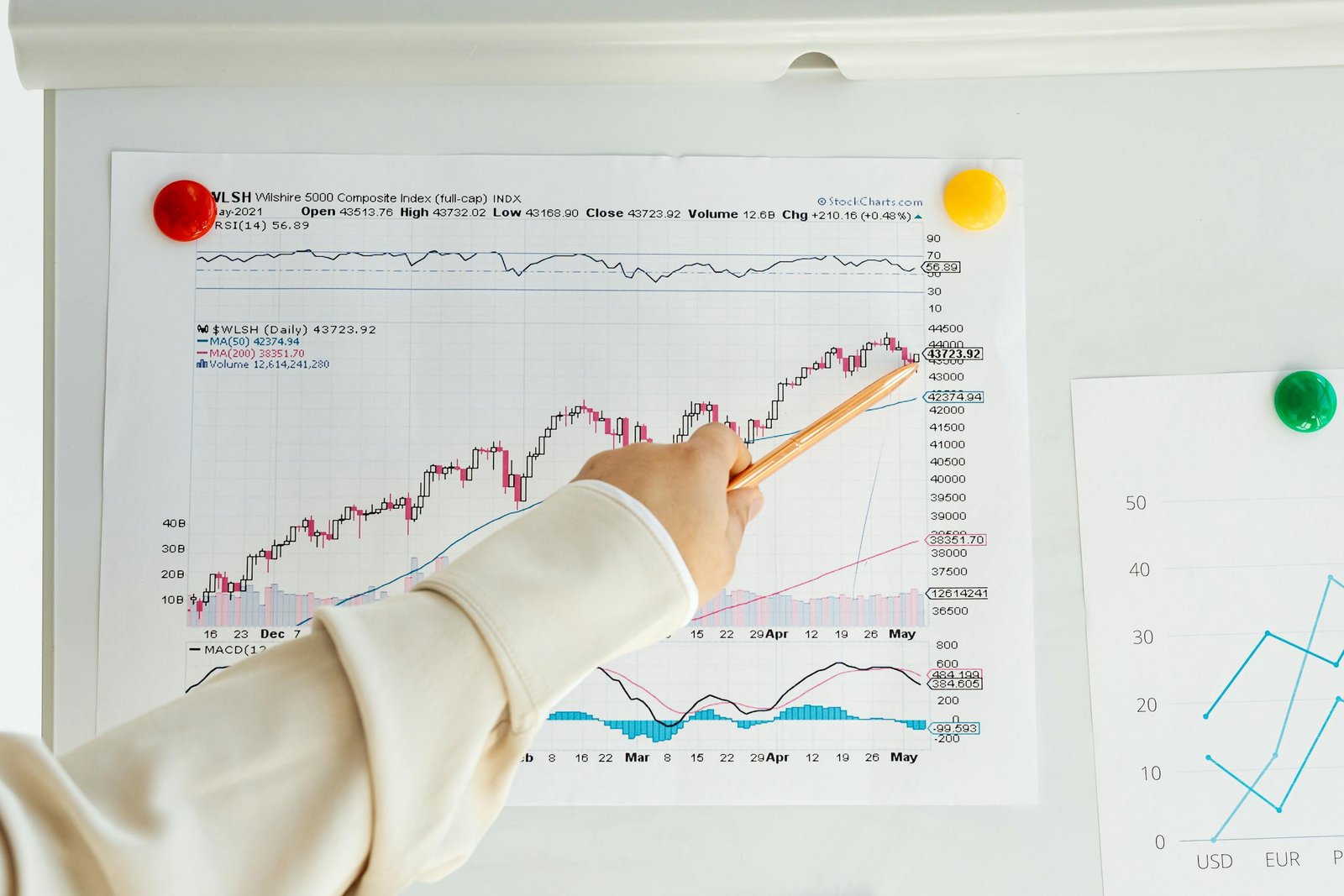
A stock chart is like a map of a stock’s price over days, weeks, or even years. It shows you price movements such as the opening price, closing price, highest, and lowest points during a set time frame.
You also see the trading volume, which tells you how many shares changed hands. Most charts use lines or candlesticks to display this data.
Candlestick charts are popular because they show not just prices but also whether buyers or sellers dominated during that period. You’ll also find trend lines that show if a stock is generally going up, down, or sideways.
Pro tip: Look for sudden spikes in volume combined with price jumps. This often means major news or big traders are influencing the stock.

Why Reading Stock Charts Matters
If you can read stock charts well, you’ll catch signs before prices shift. This skill helps you avoid buying at a high or selling at a low.
You get to see the support and resistance levels, which show where a stock usually stops falling or rising. Reading charts also helps you spot trends early.
For example, a steady upward trend means more buyers, which is usually a good sign. But watch out for fakeouts—short spikes that quickly reverse.
These tricks happen often, so don’t rush to trade based on one big move. Insider hack: Pay attention to how the stock behaves near important price levels.
If it breaks through resistance with high volume, it might be strong for a while.
Key Terms You Need to Know
- Trend Line: A line that shows the direction of the stock price (up, down, or sideways).
- Support Level: A price point where the stock tends to stop falling.
- Resistance Level: A price point where the stock tends to stop rising.
- Volume: The number of shares traded in a time period.
- Candlestick: A type of chart display that shows open, high, low, and close prices.
- Breakout: When the price goes past a support or resistance level.
- Pullback: A short move against the trend before it continues.
Familiarizing yourself with these terms makes reading any stock chart easier. It lets you focus on what matters and make quicker decisions without second-guessing yourself.
Exploring Different Types of Stock Charts
Stock charts come in different styles, and each one shows price movements in a unique way. Some focus on simple trends, while others offer deeper insight into market behavior like opening and closing prices or volume changes.
Knowing what each chart type tells you can help you spot opportunities and avoid pitfalls.
Line Charts Explained
Line charts are the simplest type of stock chart. They connect closing prices over time with a continuous line.
This makes it easy to see the general trend, whether the stock is going up or down. Because line charts show only closing prices, they don’t capture daily highs, lows, or opening prices.
This can make them less useful for quick trades but great for spotting long-term trends.
A pro tip: Use line charts alongside other types to confirm overall trend direction without getting distracted by daily price noise.
Bar Charts: More Than Just Lines
Bar charts pack in more info than line charts. Each bar shows the stock’s open, high, low, and close prices for a time period.
You get a vertical bar for price range, with horizontal ticks marking open (left) and close (right). This extra detail helps you see where price moved during the day and whether buyers or sellers had control.
Bars leaning up indicate bullish sessions and down for bearish. Insider hack: Watch for patterns like “double bottoms” or “flags” in bar charts as clues for potential turning points.
Candlestick Charts Demystified
Candlestick charts are a favorite because they show the same data as bar charts but in a more visual way. Each candle has a body between open and close prices, and wicks showing highs and lows.
The color of the candle body tells you if the price went up (often green) or down (often red). Candlesticks also form specific shapes that hint at future price moves, like “Doji” or “Engulfing” patterns.
For a sharp edge, try spotting clusters of candles that signal support or resistance. Candlestick patterns can be tricky, so combine them with volume and trend analysis for better results.
Essential Components of a Stock Chart
When you look at a stock chart, you’re mostly seeing how the stock’s price changes over time. Alongside price, volume and time frames shape the story behind those changes.
Knowing how to read each part helps you spot real trends, avoid false signals, and better plan your trades.
Time Frames and Their Importance
Time frames show you the length of time each data point on the stock chart covers. It can be as short as one minute or as long as a year.
For example, a daily chart shows price moves for each day, while an hourly chart breaks it down further into each hour. You want to pick your time frame based on your trading style.
Day traders often prefer short time frames (1-minute, 5-minute charts) to catch quick moves. If you’re holding for weeks or months, look at daily or weekly charts to spot bigger trends.
Pro tip: Zoom out to a higher time frame for better perspective. Sometimes a short-term drop looks scary until you see it’s just a small blip on a monthly chart.
How to Read Price Movements
Price movement on a stock chart is displayed as a line, bar, or candlestick, each showing different details. Candlestick charts are popular because they give you four key prices: open, close, high, and low for each time frame.
Look for patterns like hammers, doji, or engulfing candles, which can hint at reversals or continuation of trends. A green candle usually means the stock closed higher than it opened, while red means it closed lower.
Remember, price moves often make small zigzags. Don’t get tricked by quick ups or downs.
Use trendlines to spot the general direction and watch for breaks above or below these lines to spot potential shifts.
Understanding Volume Indicators
Volume tells you how many shares traded during a specific time. High volume with a price increase usually signals strong buying interest, which can push prices higher.
On the flip side, price drops on heavy volume show intense selling pressure. Volume spikes often come before big moves, so keep an eye on unusual volume surges.
This can be your early warning to act. Also, use volume to confirm patterns; for example, a breakout above resistance is more reliable if volume jumps alongside it.
Insider hack: Check volume relative to the stock’s average daily volume. A 50% increase in volume can be much more meaningful if the stock normally trades low volumes.
This helps you separate real moves from noise.
Spotting Trends and Patterns Like a Pro
To read stock charts well, you need to see how prices move over time and know where they might change direction. This means spotting clear trends and understanding key price levels where stocks tend to pause or reverse.
Identifying Uptrends and Downtrends
An uptrend happens when a stock makes higher highs and higher lows over time. You’ll see the price moving steadily upwards with small pullbacks.
This pattern shows buyers are in control, and momentum is strong. A downtrend is the opposite.
The stock makes lower highs and lower lows. Sellers take charge here, pushing the price down steadily.
Pro tip: Use trendlines to connect these highs and lows. Draw a line under rising lows for an uptrend or above falling highs for a downtrend.
This helps you spot the trend early. Watch for trend changes by looking for at least two higher highs in an uptrend or two lower lows in a downtrend.
This confirms the pattern, so you’re not tricked by a quick reversal.
Support and Resistance Levels
Support is where a falling stock tends to stop dropping and bounces back. Think of it like a price floor.
Sellers slow down, and buyers step in, often at a past low point. Resistance is the opposite—it’s a price ceiling.
When a stock rallies, it may hit resistance and stop climbing. Buyers hesitate, and sellers become more active.
You can mark support and resistance levels by looking at past price points where the price reversed multiple times. These levels are psychological barriers many traders watch.
Insider hack: Pay attention to volume at these levels. High volume on support means strong buying interest.
Low volume on a break above resistance can mean the breakout won’t last. Also, watch for support turning into resistance or resistance turning into support after a price break.
That flip often signals a bigger move ahead.
Using Indicators and Tools for Technical Analysis
When you start reading stock charts, you’ll find many ways to understand price movements. Some tools help you spot trends, and others show you when a price might change.
You’ll likely want to focus on ones that give clear signals without too much confusion. They can guide your decisions about when to buy or sell.
Making Sense of Moving Averages
Moving averages smooth out price data to show trends more clearly. The most common types are the Simple Moving Average (SMA) and the Exponential Moving Average (EMA).
The SMA calculates the average closing price over a set time, like 20 or 50 days, giving you a clear line that tracks the market’s general direction. For traders and investors, moving averages help identify support or resistance levels.
If the price stays above the SMA, the market might be in an uptrend. When it drops below the SMA, that could mean a downtrend is starting.
A neat trick is using multiple SMAs with different time frames, like 20-day and 50-day. When a shorter SMA crosses above a longer one, it’s often a sign the trend is turning bullish.
This crossover is a popular entry signal for many traders.
How to Use SMA in Your Analysis
To use SMA effectively, pick the right time frame that matches your trading style. Day traders might use short periods like 10 or 20 days, while long-term investors might focus on 50 or 200-day SMAs.
The longer the period, the smoother the line, but the slower it responds to changes. Watch for price interaction with the SMA.
Price bouncing off the SMA can signal a strong trend. When price breaks sharply through the SMA, expect increased volatility or a possible reversal.
Pro tip: combine SMAs with volume indicators to confirm if moves are backed by strong buying or selling. This helps avoid false signals caused by low volume or random price spikes.
Using SMA with other tools can add confidence to your trades without overcomplicating your setup.
Making Smart Moves: Entry and Exit Strategies
Knowing when to get in or out of a stock can make a big difference in your trading results. You’ll want to watch for clear signals on the chart that show momentum is shifting either up or down.
Spotting these right can help you buy low and sell high, saving you from costly mistakes.
Recognizing Buy Signals
A strong buy signal usually shows up when a stock breaks above a key resistance level. This means the price moved past a ceiling where sellers once stopped it.
Look for higher volume during this breakout—that tells you more buyers are stepping in. Candlestick patterns like the “hammer” or a cluster of green candles can hint the price might rise soon.
Also, pay attention to moving average crossovers—when a short-term average crosses above a long-term one, it often signals an uptrend is starting. Don’t chase every breakout.
Wait for a confirmation candle that closes above the breakout point. This reduces the risk of false signals in choppy markets.
Spotting Sell Opportunities
Selling is just as important as buying. Start watching when the stock hits a resistance level and starts to form lower highs.
That shows momentum may be fading. Bearish candlestick patterns, like the “shooting star” or “engulfing” red candle, often point to upcoming price drops.
If volume spikes on down days, it usually means sellers are gaining control. A key trick is to watch moving averages too.
When a short-term moving average crosses below a longer-term one, it’s a signal the uptrend might be over and it’s time to exit. Set stop-loss orders just below support levels to protect your gains if the price falls suddenly.
Putting It All Together for Confident Trading
Knowing how to read stock charts is just the start. To trade confidently, you need to mix different chart types and indicators smartly.
Building a clear routine helps turn analysis into actions that work.
Combining Chart Types and Indicators
Using one chart type or indicator alone can give you a limited view of the market. Try mixing line charts for long-term trends and candlestick charts to spot daily price moves.
Bar charts can add detail on price highs and lows. Add key indicators like moving averages to smooth out price noise.
Use the Relative Strength Index (RSI) to check if a stock looks overbought or oversold. When moving averages and RSI line up, it’s a stronger signal.
Watch volume spikes closely. A price rise with high volume usually means real interest.
If volume is low, the move might not last. Don’t forget trendlines to spot support and resistance levels.
These act like floors and ceilings for price that often guide when to buy or sell.
Developing Your Trading Routine
Trading isn’t just about the charts. You need a routine to turn analysis into smart decisions.
Start your day by checking key stocks on multiple timeframes: daily, weekly, and even intraday if you trade often. Mark important support and resistance levels.
Keep a simple checklist:
- Identify the trend with moving averages
- Check RSI for momentum
- Confirm with volume
- Look for candlestick patterns
Journal your trades. Write down why you entered, your exit plan, and what you learned.
This habit builds your skills faster. Avoid chasing stocks after sharp moves up or down.
Wait for a clear setup supported by your chosen indicators. Patience is often the best tool in your trader toolbox.
Frequently Asked Questions
You’ll want to know how to read the lines on a chart, spot important patterns, and understand how different chart types work.
Knowing which indicators to watch and when to check charts can really sharpen your trading skills.
What do those lines on a stock chart actually mean?
The lines usually show the stock price over time. The vertical axis (Y-axis) shows price levels, while the horizontal axis (X-axis) shows time.
If you see a straight line connecting low and high points, that’s a trendline. It helps you see if the price is generally going up or down.
Can you break down the basic patterns I should look for?
Look for repeating shapes like the Doji, which means the price opened and closed almost the same, signaling market indecision.
The Hammer pattern appears after a drop and shows a potential bounce back because buyers stepped in near the low.
These basic patterns can hint at future price moves, but watch volume for confirmation.
How do candlestick charts differ from traditional line graphs?
Line graphs just show the closing price over time with a single line.
Candlestick charts give you more info: open, close, high, and low prices for each time period.
The color tells you if the price went up (usually green) or down (usually red). This extra detail helps you spot short-term trends and market sentiment faster.
Is there a simple way to spot trends in the market?
Draw a trendline connecting two or more price points. If it’s moving up, that’s an uptrend; moving down means a downtrend.
Watch out for pullbacks—brief moves against the main trend. They can be good chances to buy or sell if you time it right.
What indicators can help me understand a stock’s performance?
Moving averages smooth out price data, like the 50-day average, showing where prices generally are.
RSI (Relative Strength Index) tells you if a stock might be overbought or oversold. MACD (Moving Average Convergence Divergence) shows momentum changes.
Combine these with volume spikes for stronger signals.
How often should I check stock charts for the best analysis?
It depends on your style. Day traders look at charts minute-by-minute.
Long-term investors benefit from checking weekly or monthly charts. This helps avoid getting caught in short-term noise.
A quick trick: zoom out to a longer timeframe before making big decisions. It helps you see the overall trend better.